 After several days of digesting and analyzing the new NFL Nike uniforms (which were unveiled on Tuesday), I've been able to formulate some opinions on the new Rams duds. So here's my two cents (or so) on the new unis:
HELMET
The helmet is the same; not sure if Nike had any jurisdiction in this department. The Rams horns do look a little more menacing with the jersey, however.
JERSEY
The Rams jersey looks basically the same as before. The jersey is a little tighter, the shoulder stripes are a little sleeker, and the numbers seem a bit more compact (that is, not as "rounded"). However, the most noticeable change seems to be the collar. The Rams went ahead with Nike's new Flywire collar, designed to perform a fit and snug look around the neckline (so as to avoid this). The Flywire design unfortunately creates a two tone collar effect, with the Rams no longer having a single gold neckline. At first, this seems fine to me, but looking at it more I wonder whether it will have an aesthetically displeasing affect during games. Only time will tell.
 PANTS
PANTSPants are a bit different, with a more form fitting shape and possibly slightly different pockets for padding as well. The belt is now protected by side panels, while the striping down the side is now a mesh look. Overall the pants are fine, EXCEPT for the fact that the white pants are now the home pants. The gold pants are gone. This is a shame, as the Rams continue to move farther away from their classic blue and gold (*yellow) look, to their older blue and white look. Although I'm not complaining too much, I think the blue and gold look should be reserved for the past (just looking at the Colts retro unis gives and idea how similar/bland the Rams would look). But we'll get to that in a bit.
SOCKS/SHOES/GLOVES
The new socks look mostly the same, except for a strangely placed Achilles heel padding. At least there's no swooshes on the socks. The shoes look good, but I'd rather go with the white look...matches the bottom of the socks better. The gloves, however, are a complete sham on corporate advertisement. How many touchdowns will it take for fans to get over the fact that the player is simple holding up a version of their logo that, in most cases, is on the field, jerseys, and/or helmet? It's not original, to put it simply. Stick to the college traditions of old, using fingers to represent the U of Miami or the O of Oregon. Plus, exactly how often are Rams fans gonna be able to see this thing demonstrated (sorry, just had to put that in there).
ALTERNATE UNIFORMS
 Strangely, the Nike premiere on Tuesday only displayed home uniforms. Away uniforms tend to be similar to home jerseys, besides the fact that they're white (or in Dallas'/Washington's/Miami's case, color). But the biggest attention grabber should come from the team's alternate jerseys. Although no date is set to when teams will show off these new unis, some info has been leaked in some cases. A report by Jim Thomas of the St. Louis Post-Dispatch says the Rams may just use the throwbacks from last year (royal blue and yellow). However, multiple reports (including profootballtalk.com) have stated that the Rams may vie to change it up and go with the blue and white look of yesteryear. This is in part due to the fact that new head coach Jeff Fisher lost to the royal blue and yellow Rams in Super Bowl XXXIV, so such a tribute year in and year out may get him a little agitated on lost dreams. In any case, we'll just have to wait and see on this one.
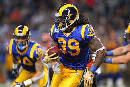
Overall, I really like the new look. It's very modern and gives the old Rams uniform a slightly updated look that makes for more intimidation. New Rams cornerback Cortland Finnegan has said himself that he likes the new duds, so that's always a good sign. Also, considering other new looks from certain division rivals, keeping the same look from the past 10 years (and, in general, the same look from the past half-century) is always a good thing.
GRADE: A-
No comments:
Post a Comment